My work: illustration
italicized: magazine
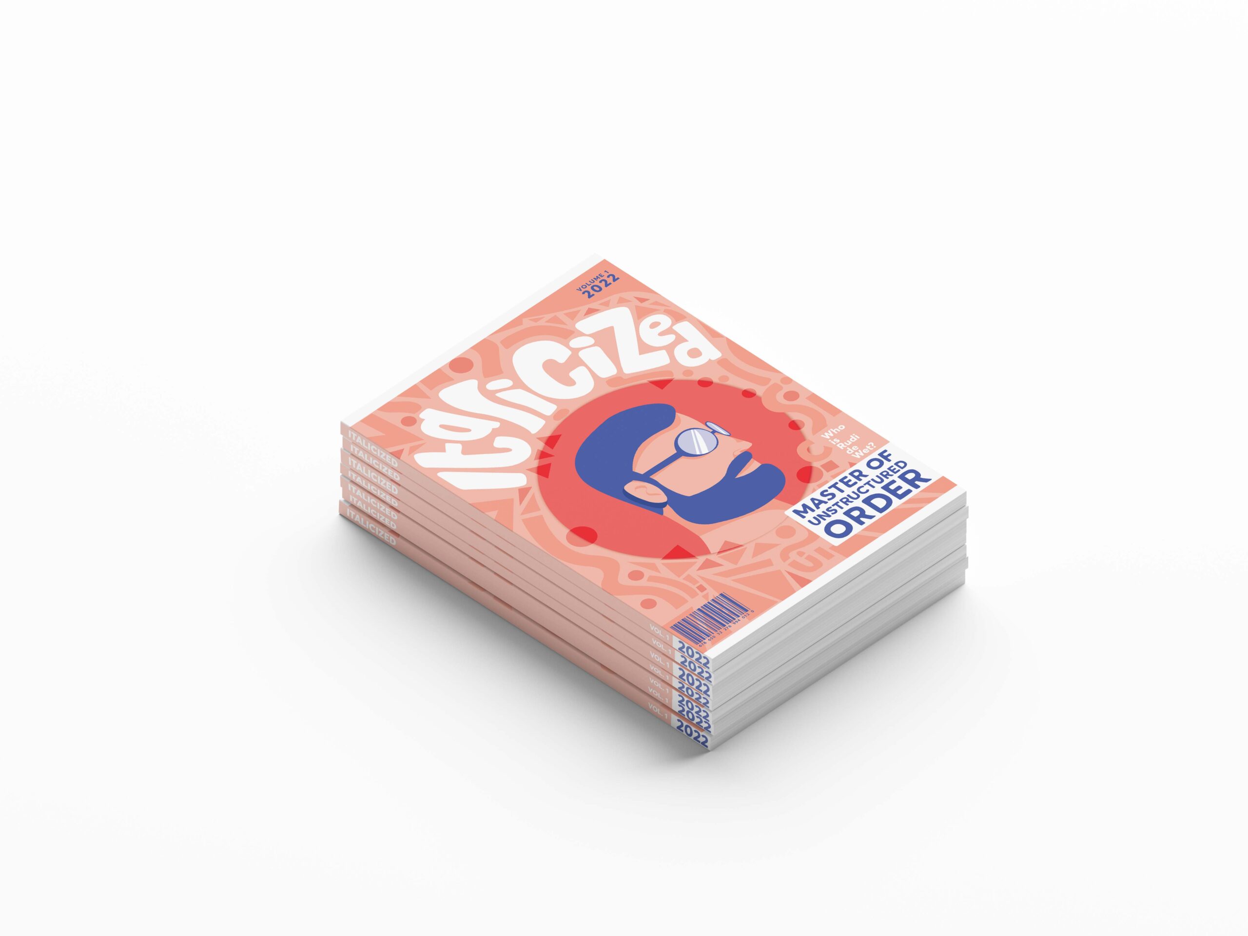
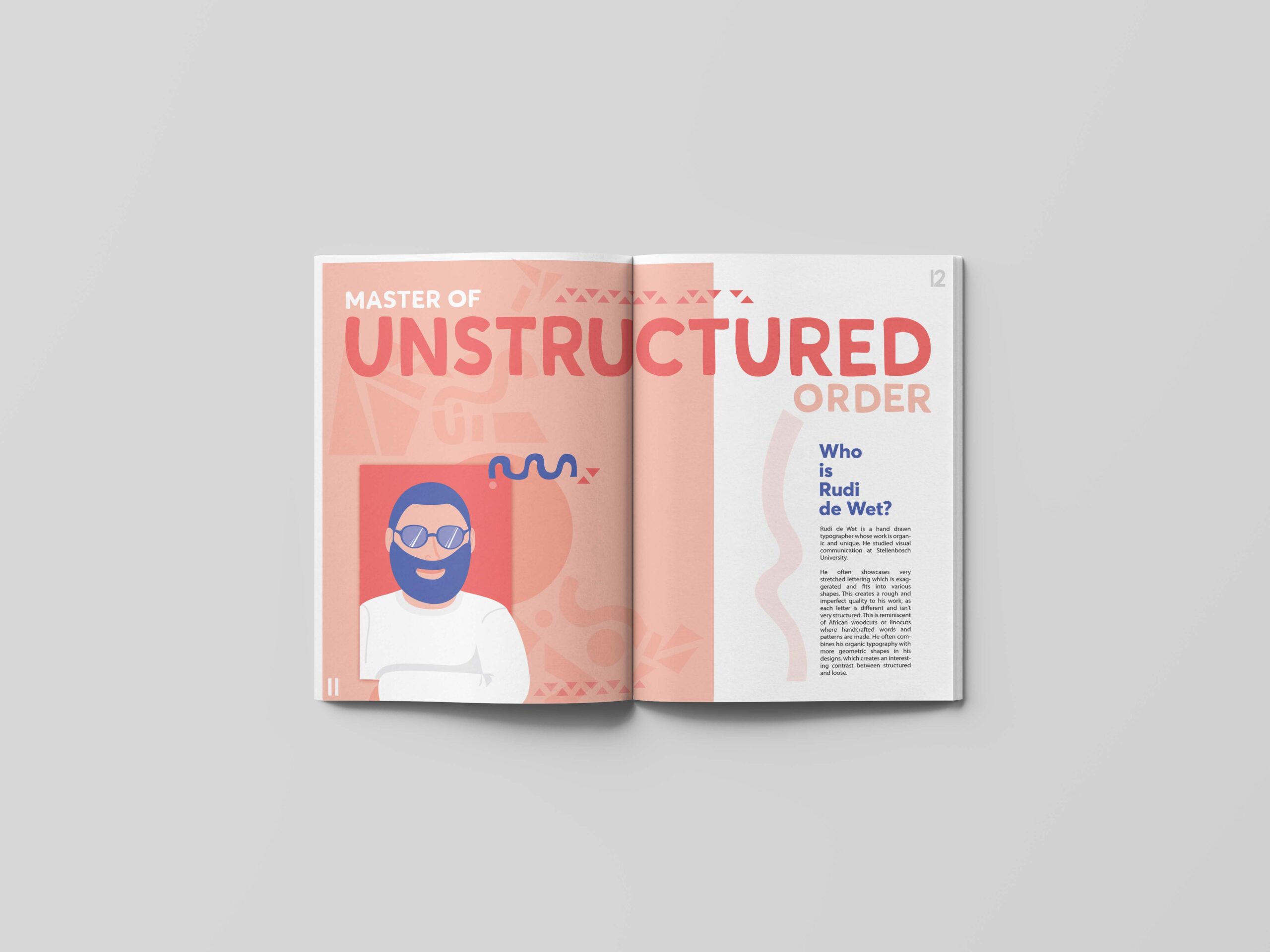
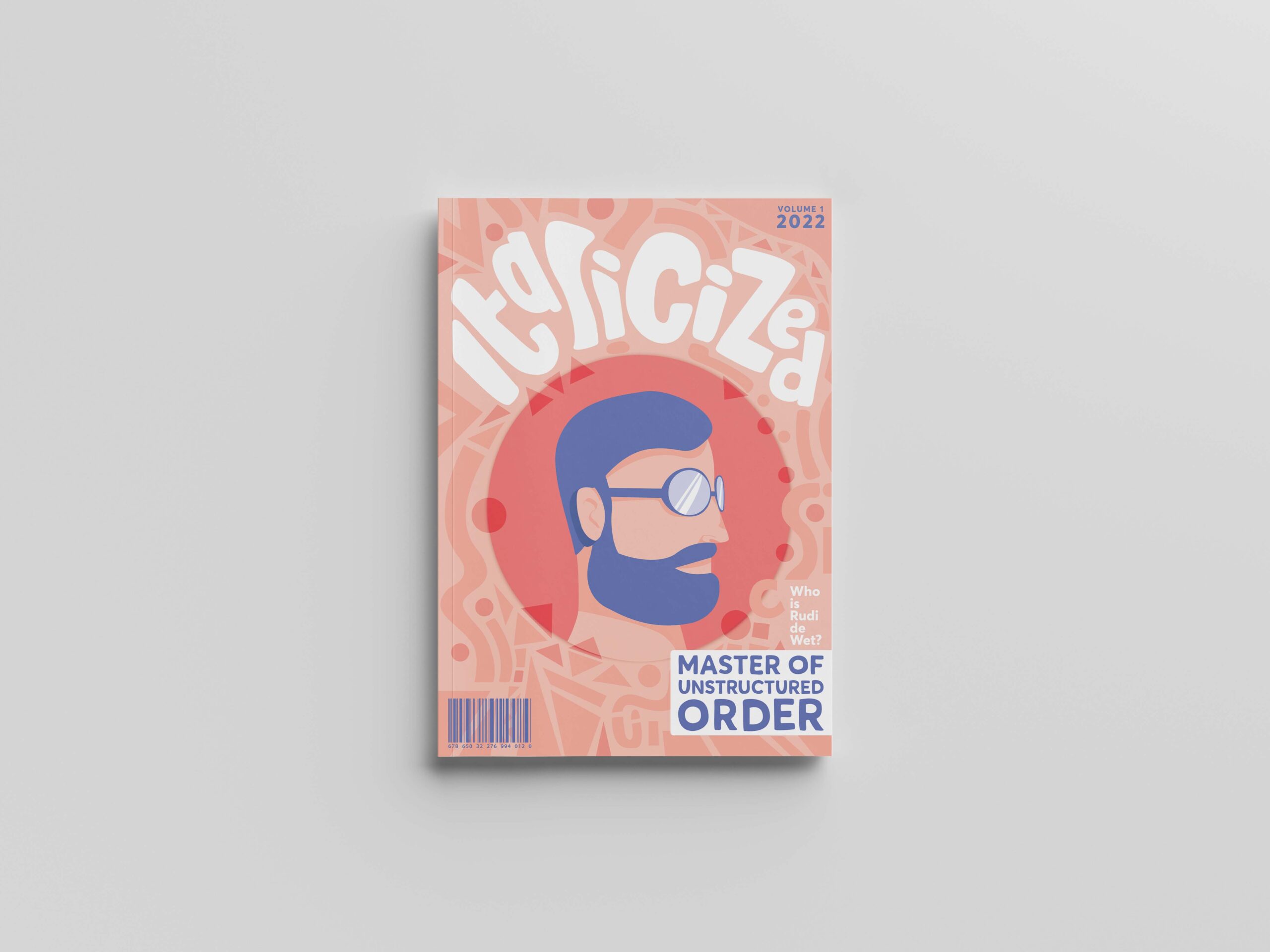
The brief for this magazine design was to create a cover and DPS for an African typography magazine, featuring a local artist.
My concept for this magazine, Italicized, was to create a magazine aimed at inspiring designers to take their own work from average to something with purpose that is different and unique. Rudi de Wet is an artist whose typography style I enjoy and tried to emulate through this design.
The play on the word ‘italicized’ also shows that something has been changed from regular to more important, carrying purpose. The African woodcut inspired illustration style uses flat bright colours and organic forms, which are directly inspired by Rudi de Wet’s hand drawn typography style. The contrast of organic and geometric also adds interest and dynamics and is something I have since adopted into my style.


album cover
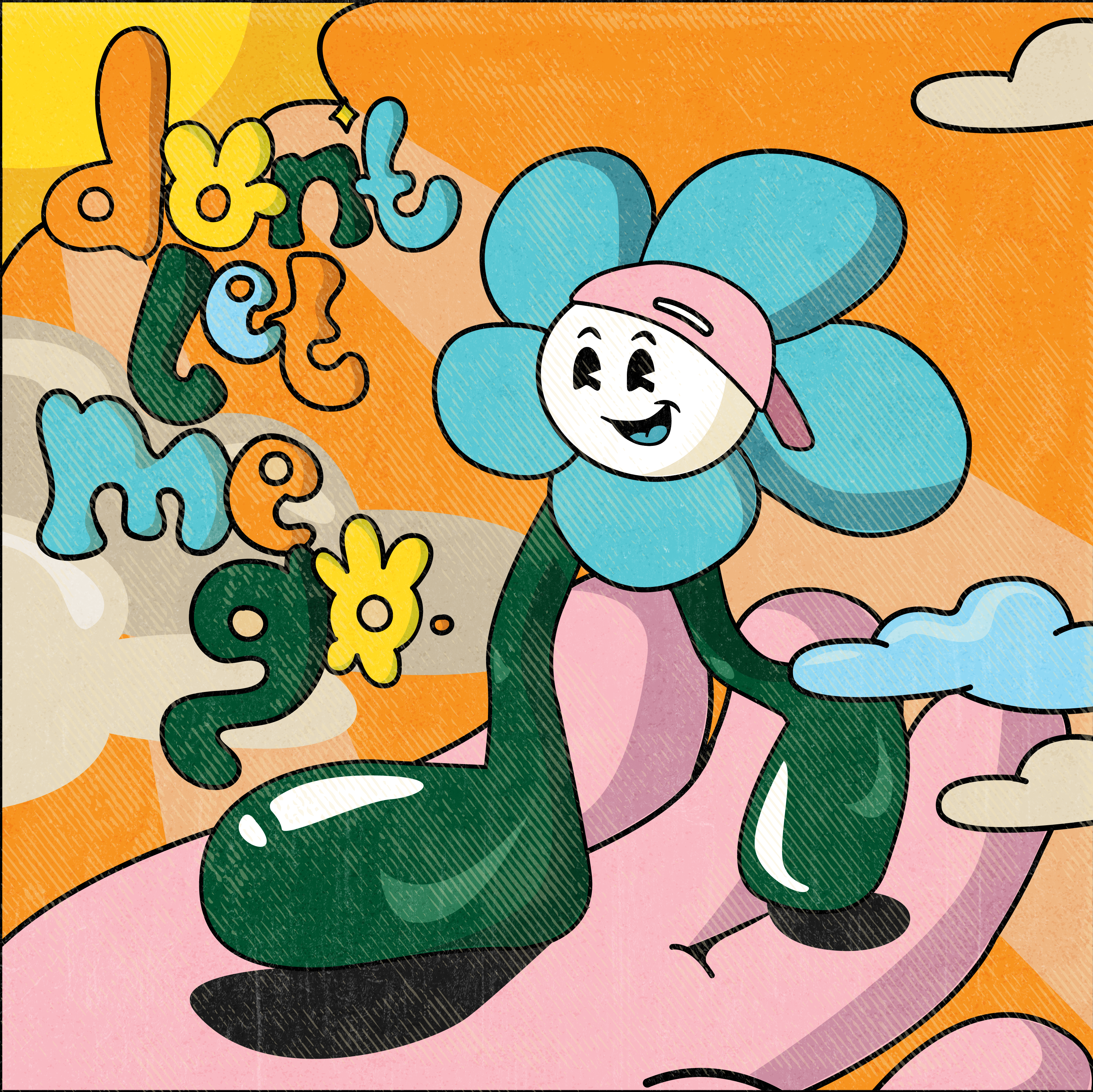
“Don’t Let Me Go.” is a song by artist, Taku Mandi, featuring a playful melody, and fusion of instrumentals, including strings, vocal manipulation and keys. The song is upbeat and catchy, represented by the vibrant, childlike colours used in the album art. This childlike, cartoony theme is carried through the design style and ties in with the song and its lyrics including “21 years, still don’t have a beard, but I gotta grow up, grow up.”
It’s a song that also talks about not knowing what the future holds, but finding hope and joy that supercedes any and all circumstances, because your life in in the hands of God. This message is shown through the symbolic hand in the illustration, as well as the sunny skies, representing a ‘new day’, and stepping out in faith.
book trilogy covers
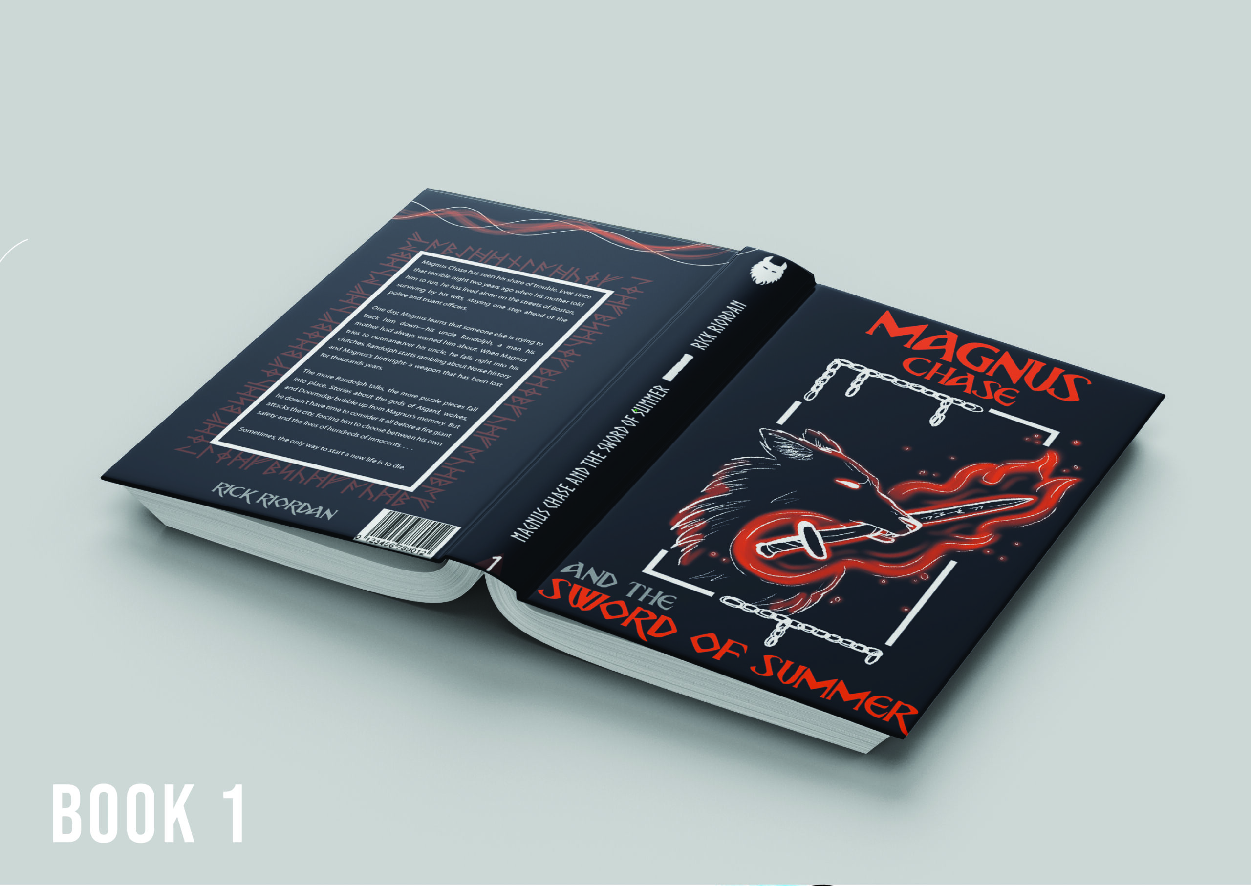
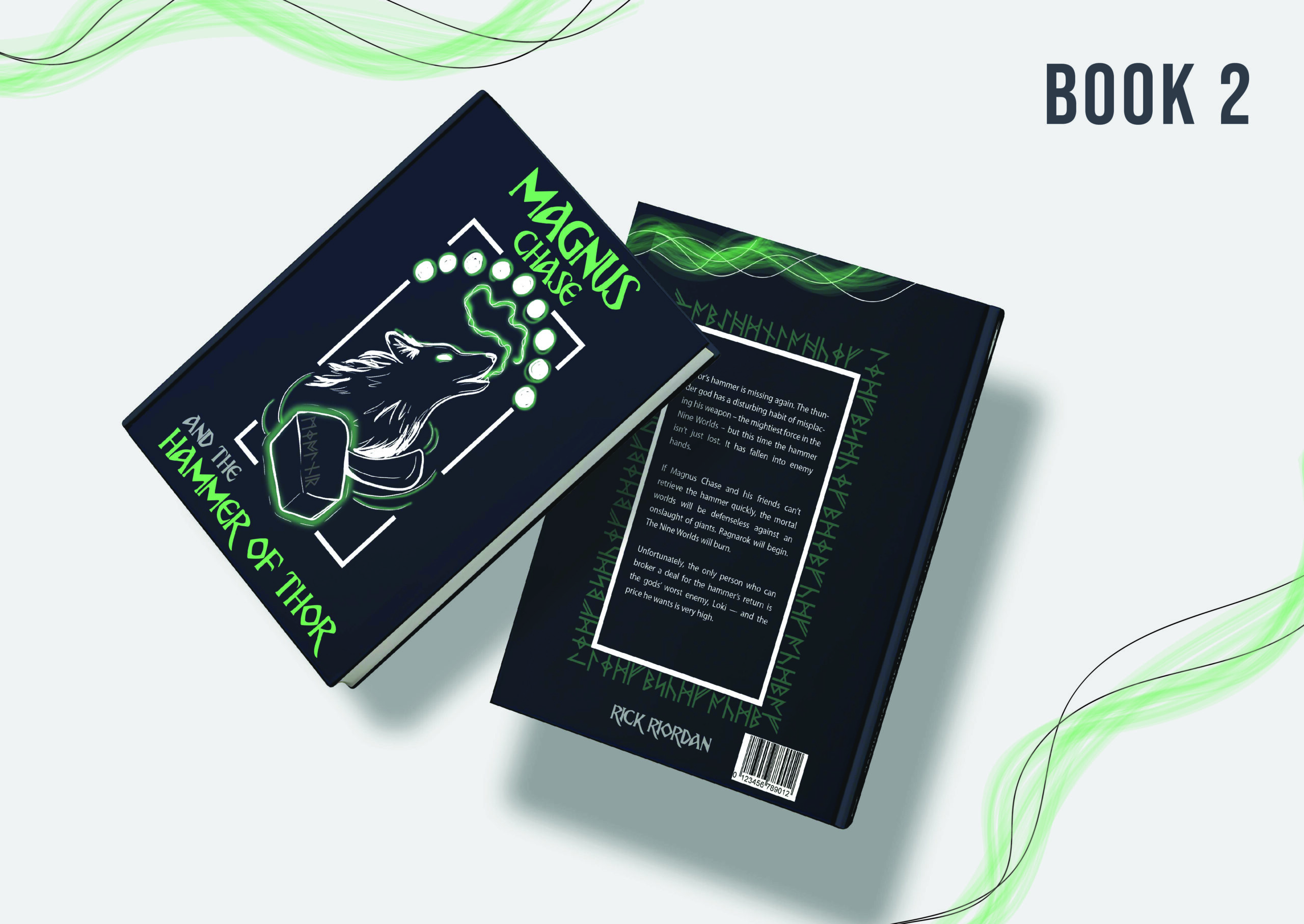
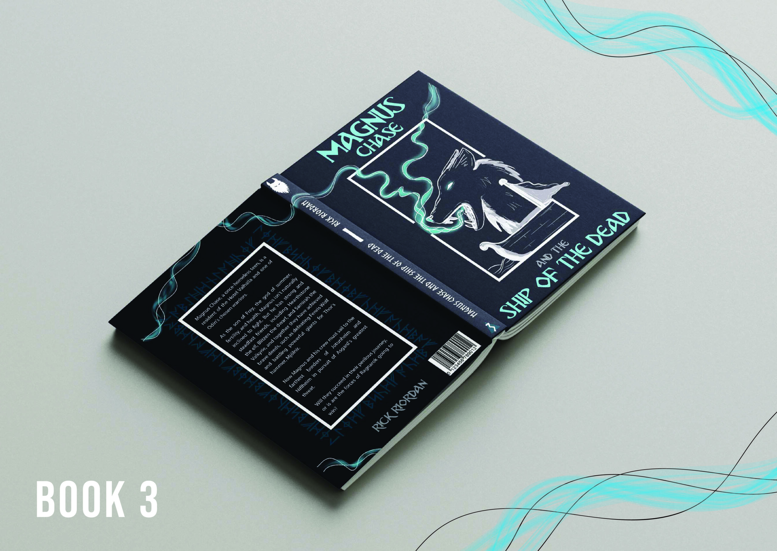
The brief for these set of book covers was to create illustrated covers for a trilogy. This is the Magnus Chase series by author, Rick Riordan. The books focus on Norse mythology and are centred around the end of the world, or Ragnarök, and the wolf who causes it, Fenrir.
I wanted to depict a wolf figure in each cover, changing up the pose and other elements. I decided to illustrate in a high contrast style, by using white illustration on a dark background. This adds to the dark, sombre theme of the books. Each book has one accent colour, drawing the eye to the important points of each book. This also enables the viewer to distinguish more easily between the three books in the trilogy.
